PROJECT OVERVIEW
Baked Paws is a playful dog treat company that needed a full brand identity to reflect its fun, pet-loving personality. This student project focused on building a visual identity from the ground up, including logo design, packaging, and marketing materials, to bring the brand to life in a cohesive and engaging way.
OBJECTIVE
Create a full brand identity for a fictional pet treat company, including a logo, packaging, and supporting materials that reflect the company's fun, trustworthy, and wholesome personality.
MY ROLE
As the designer on this project, I developed the brand from concept to execution. I created a logo system, playful packaging, and print collateral. The visual style emphasized bright colors, clean typography, and friendly illustrations to evoke a sense of joy. Every element was designed to feel approachable and consistent across applications.
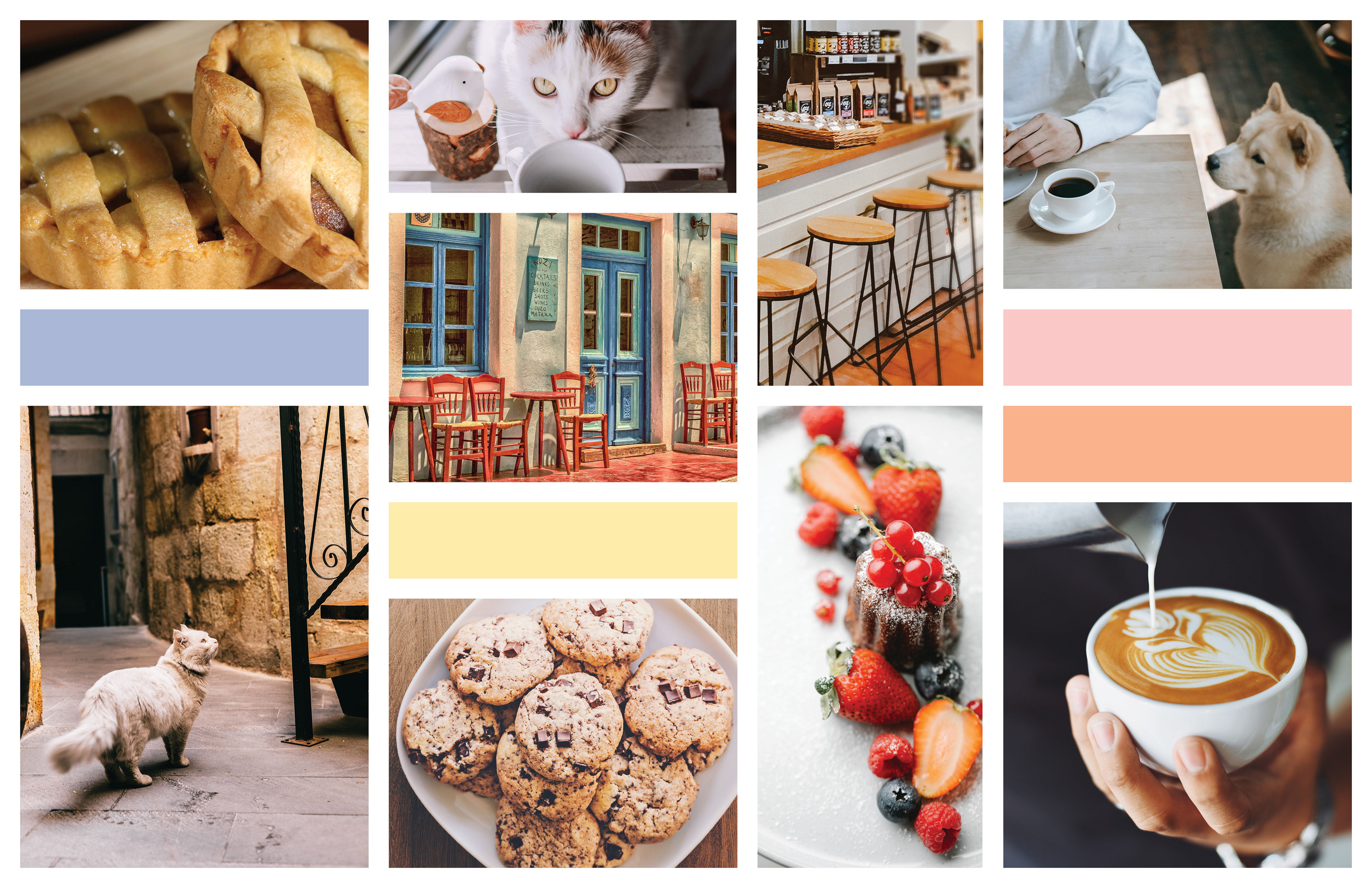
MOOD BOARD
Before I started brainstorming possible logos, I started with a mood board to help visualize the type of vibe and atmosphere that best captures the company. From the design brief, the company is looking for a warm, trustworthy, and welcoming atmosphere without the cliché feel of a café. To help combat this issue, I have a variety of warm colors, with one or two cool colors to help balance the colors out.
SKETCHES
When I created sketches, I first started with the obvious - a pawprint. Due to the nature of the business, it felt the most fitting. However, as my ideas developed, so did my sketches. I moved onto line work and silhouette of animals, as well as baked goods that might be used to represent the business.
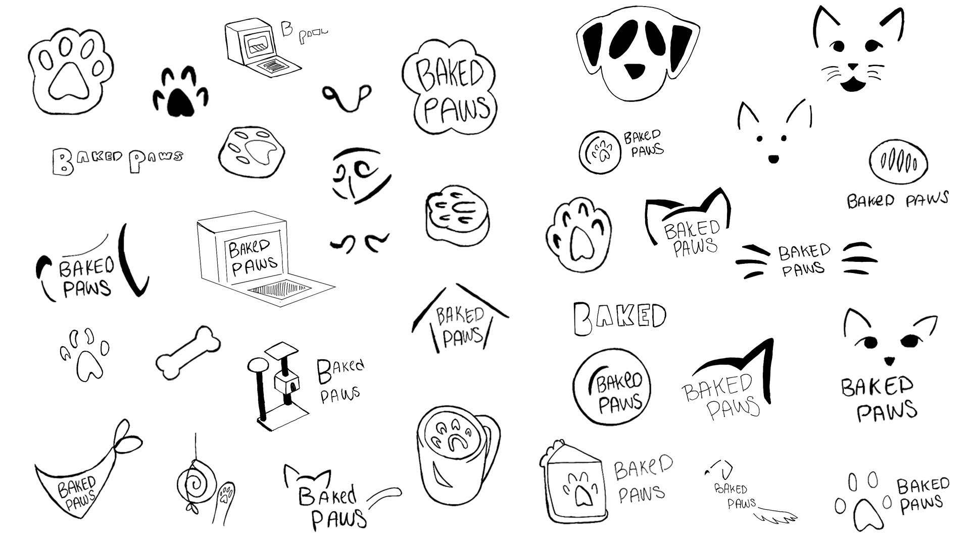
Logo Sketches
DIGITALIZATION
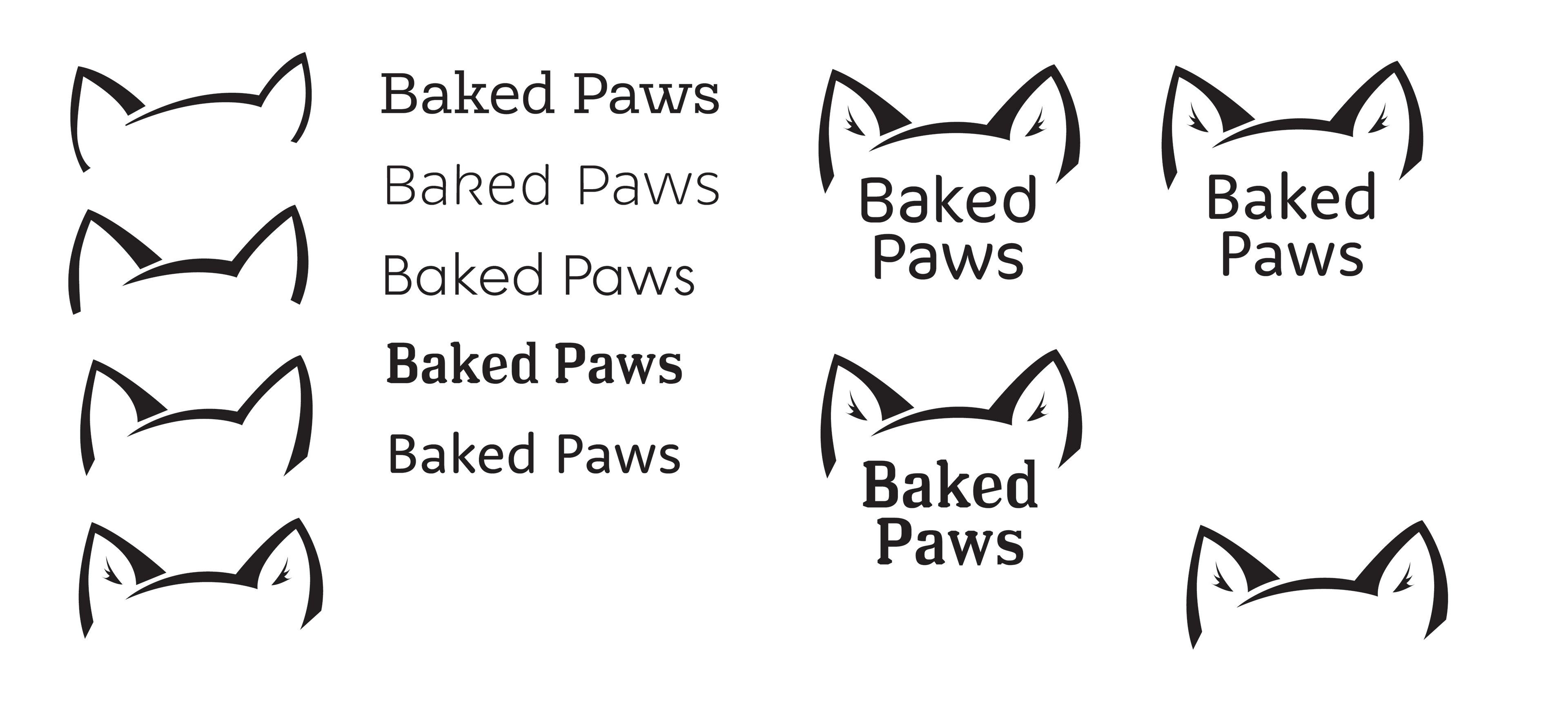
I ultimately decided on the design below, so when I moved onto digitalizing the artwork, I focused on how the line is formed and finding a font that best matches how the logo is displayed.
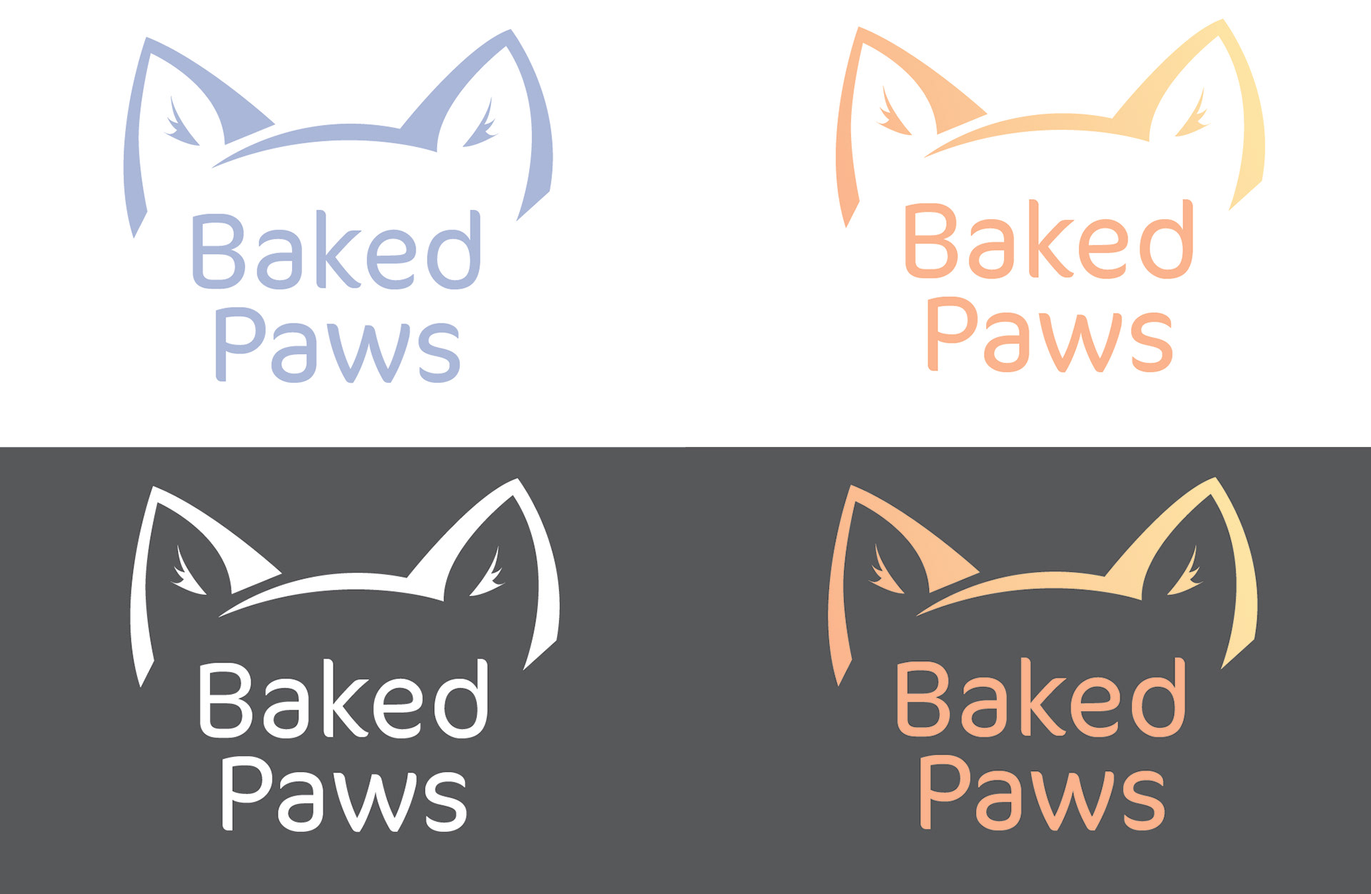
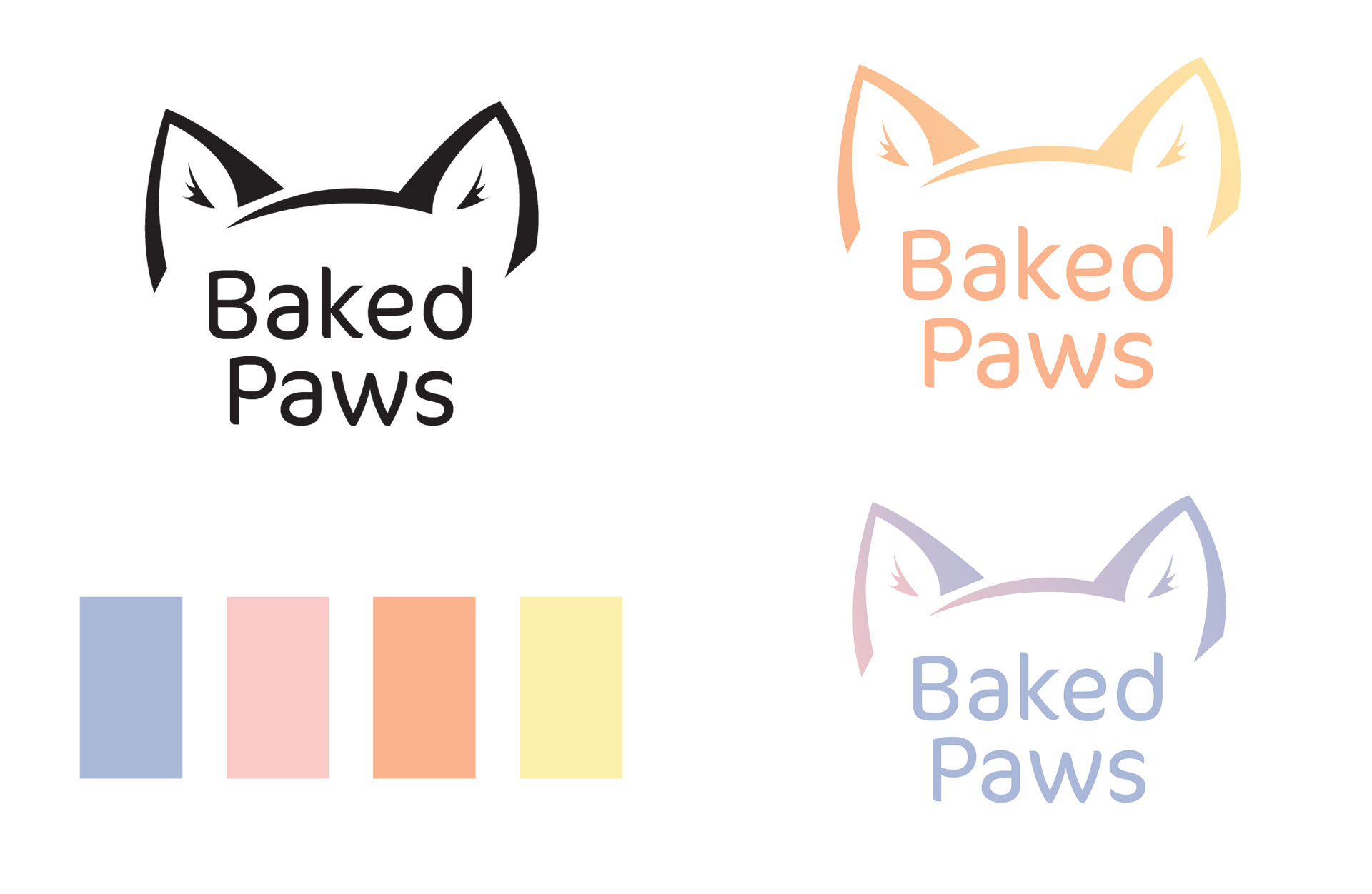
COLOR EXPLORATION
Then, I moved onto to the color of the logo. I used the colors that were used on the mood board and played with different gradients.
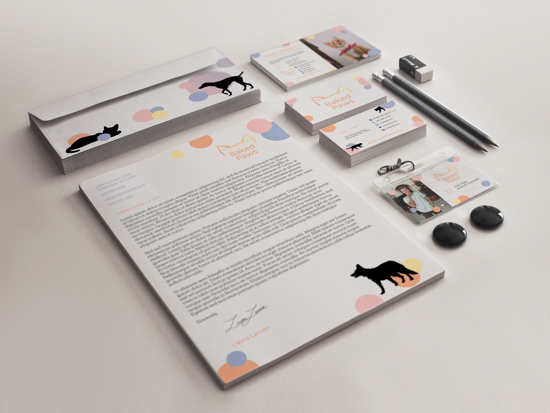
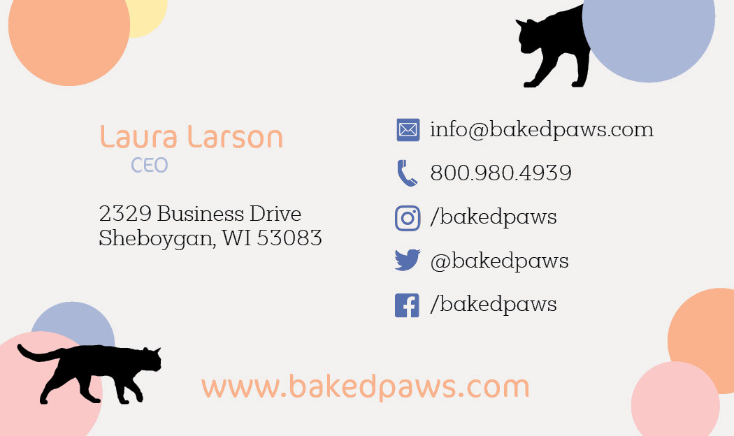
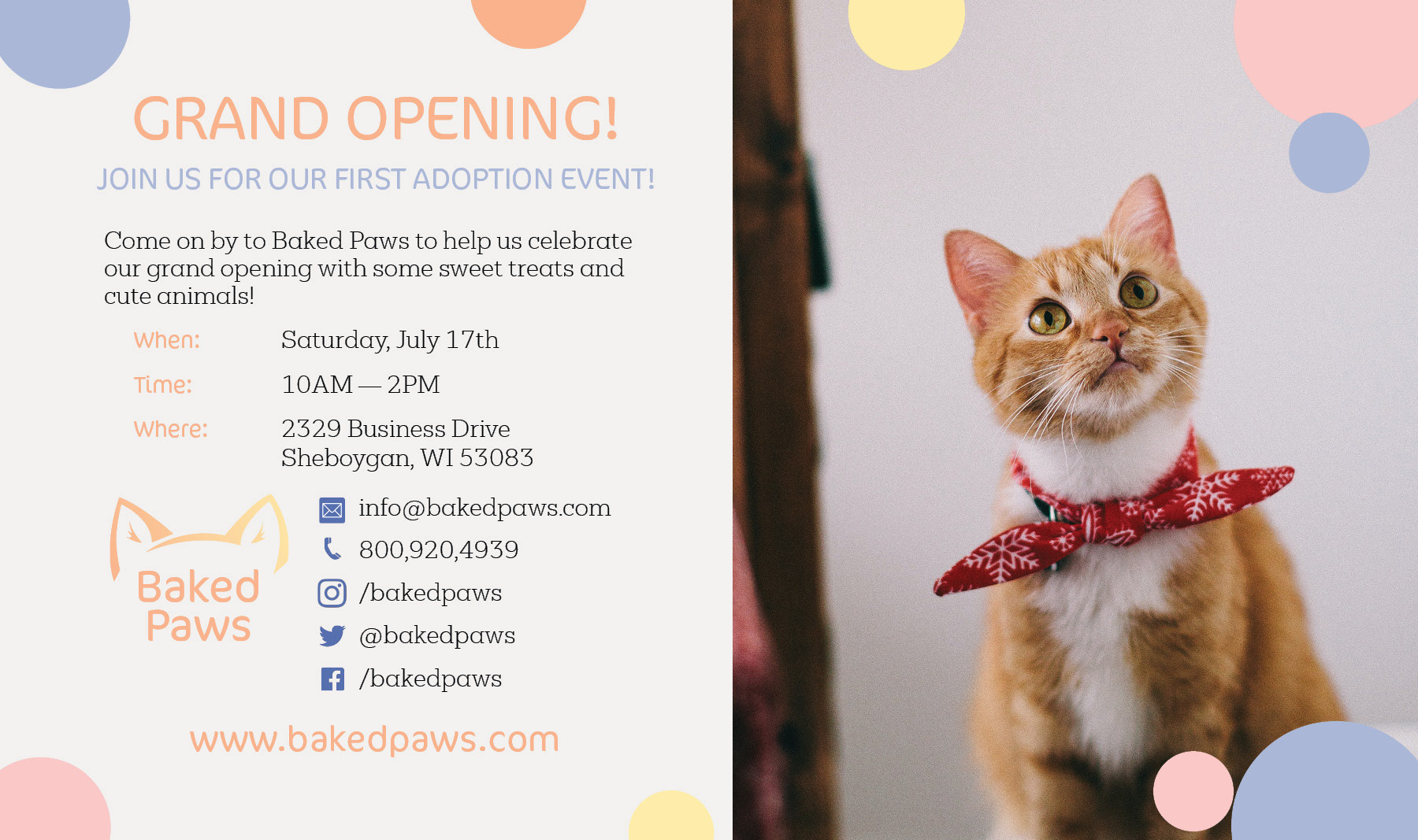
FINAL PRODUCT
Using the colors and line art from the logo, I moved onto creating marketing materials. I created a cohesive look through the use of the brand's colors and themes, such as pastel circles and silhouettes of animals. This gives each piece an overall feeling of warmth to those who view them. The variety of the brand is established within the silhouettes and the placement of the circles.
BRAND IDENTITY